

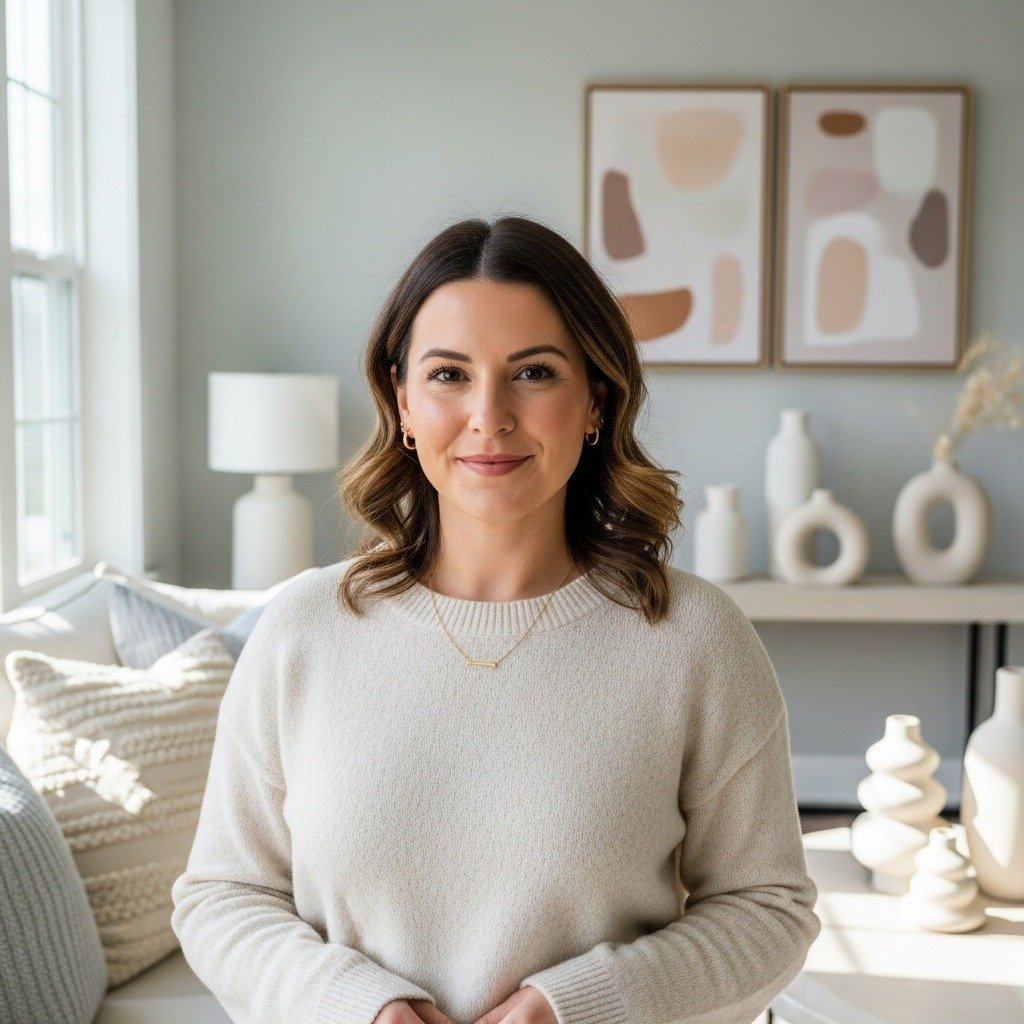
Ever walk into a room and feel instantly calm—like everything just belongs together? That’s the magic of color coordination done right. A well-coordinated room doesn’t feel flat or forced. It feels intentional, welcoming, and easy on the eyes. The good news? You don’t need a designer budget or a color theory degree to pull it off.
Let’s break down how to decorate a color-coordinated room that truly flows, step by step.
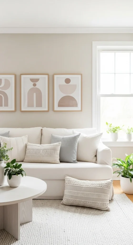
Start With One Core Color
Every flowing room begins with a single anchor color. This is the shade that quietly sets the tone for everything else.
Think of it as your foundation—not something loud, but something flexible.
Good core color choices include:
- Soft beige or warm white for timeless spaces
- Muted sage or dusty blue for relaxed rooms
- Warm gray or greige for modern homes
Once chosen, this color should appear in at least three places in the room:
- Walls or large furniture
- Textiles (curtains, rugs, pillows)
- Small accents (vases, books, art details)
Repeating it creates visual rhythm without being obvious.
Build a Simple Color Palette (Not a Rainbow)
A common mistake is using too many colors at once. Flow comes from restraint.
A reliable rule:
- 1 main color
- 1–2 supporting colors
- 1 subtle accent
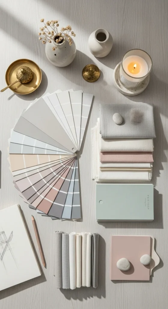
For example:
- Main: warm beige
- Support: soft blue and ivory
- Accent: brushed brass or charcoal
Keep undertones consistent. Cool colors work best together, and warm colors do the same. This keeps the room feeling unified instead of confusing.
Use Color Repetition to Guide the Eye
Flow isn’t about matching everything—it’s about echoing colors throughout the space.
Easy ways to repeat color:
- Artwork that includes your core shade
- Throw pillows that mirror rug tones
- Decorative objects that subtly match furniture
Avoid placing the same color in just one corner. Spread it around so the eye moves naturally across the room instead of stopping abruptly.
Layer Shades Instead of Exact Matches
Exact color matches can feel stiff. Layering different shades of the same color adds depth and softness.
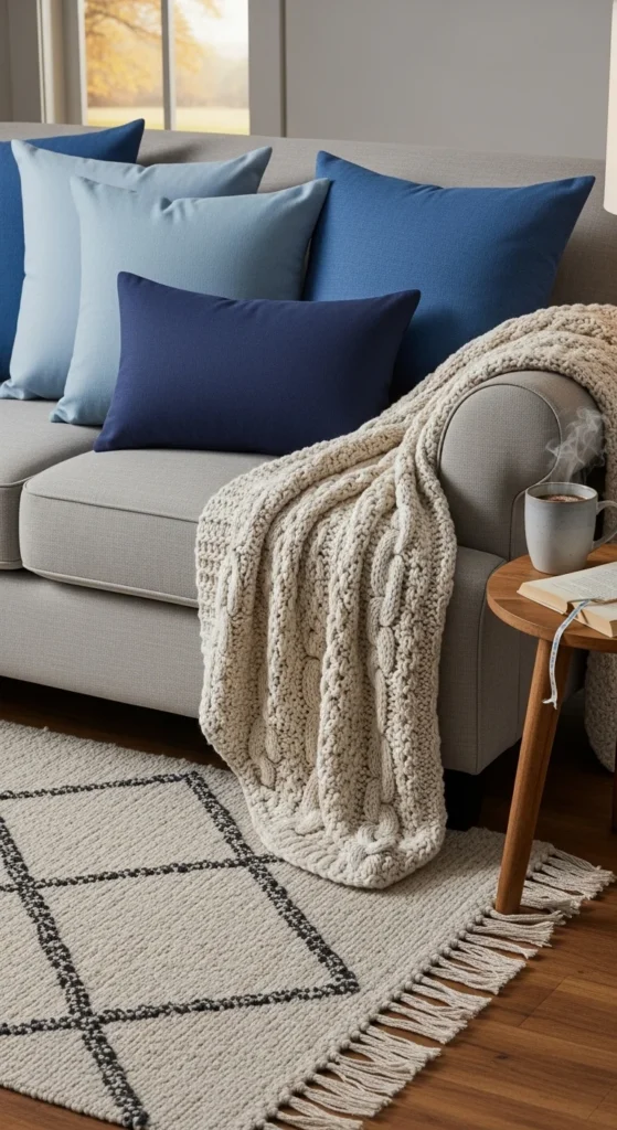
Try mixing:
- Light, medium, and deep versions of one hue
- Different textures in the same color family
- Matte and slightly glossy finishes
This approach keeps your room interesting while still cohesive.
Balance Color With Neutrals
Neutrals give your chosen colors room to breathe. Without them, even a beautiful palette can feel overwhelming.
Use neutrals for:
- Large furniture pieces
- Rugs and flooring
- Window treatments
This doesn’t mean boring. Linen textures, woven materials, and subtle patterns keep neutrals from feeling flat while supporting your color story.
Let One Area Lead the Way
Choose one focal point to anchor your color coordination:
- A statement sofa
- A bold area rug
- A feature wall
Everything else should support this feature—not compete with it. When one element leads, the room naturally feels more organized and intentional.
Tie Rooms Together for Whole-Home Flow
If your space connects to other rooms, repeat at least one color across areas.
This could be:
- The same accent color in pillows and wall art
- A shared neutral used in furniture
- Matching wood tones
You don’t need identical rooms—just gentle visual connections that help the home feel continuous.
Finish With Thoughtful Accessories
Accessories are where color coordination really shines. They add polish without commitment.
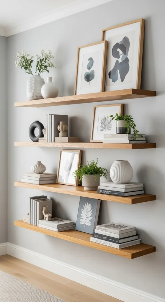
Focus on:
- Grouping decor in odd numbers
- Mixing heights and textures
- Keeping accessories within your palette
If something feels off, remove one piece. Flow often improves when you simplify.
Step Back and Edit
Once everything is in place, step away for a few minutes. When you return, notice:
- Are any colors pulling too much attention?
- Does your eye move smoothly around the room?
- Is there a calm, balanced feeling overall?
Small swaps—like changing one pillow or moving a decor item—can make a big difference.
The Takeaway
A color-coordinated room isn’t about perfection—it’s about intention. Choose a core color, repeat it thoughtfully, layer shades, and balance with neutrals. When your colors work together, the whole room feels effortless and inviting.
Save this guide for later and use it the next time your space needs a refresh.
Leave a Reply