

Have you ever walked into a room and instantly felt calm, without knowing exactly why? Often, it comes down to color. The right room color scheme doesn’t shout for attention or fade into the background—it quietly pulls everything together. Balanced color choices make spaces feel comfortable, intentional, and easy to live in, no matter your style.
In this guide, we’ll break down how to choose room color schemes that feel balanced, step by step. No design degree required—just practical tips you can actually use.
Start With the Mood You Want to Feel
Before picking paint swatches, pause and think about how you want the room to feel. Calm and relaxed? Warm and welcoming? Light and energizing?
Color has a powerful emotional impact, so defining the mood first keeps you from making random choices.
Ask yourself:
- Is this space for resting, working, or gathering?
- Do I want it to feel cozy or open?
- Should it be soothing or lively?
For example:
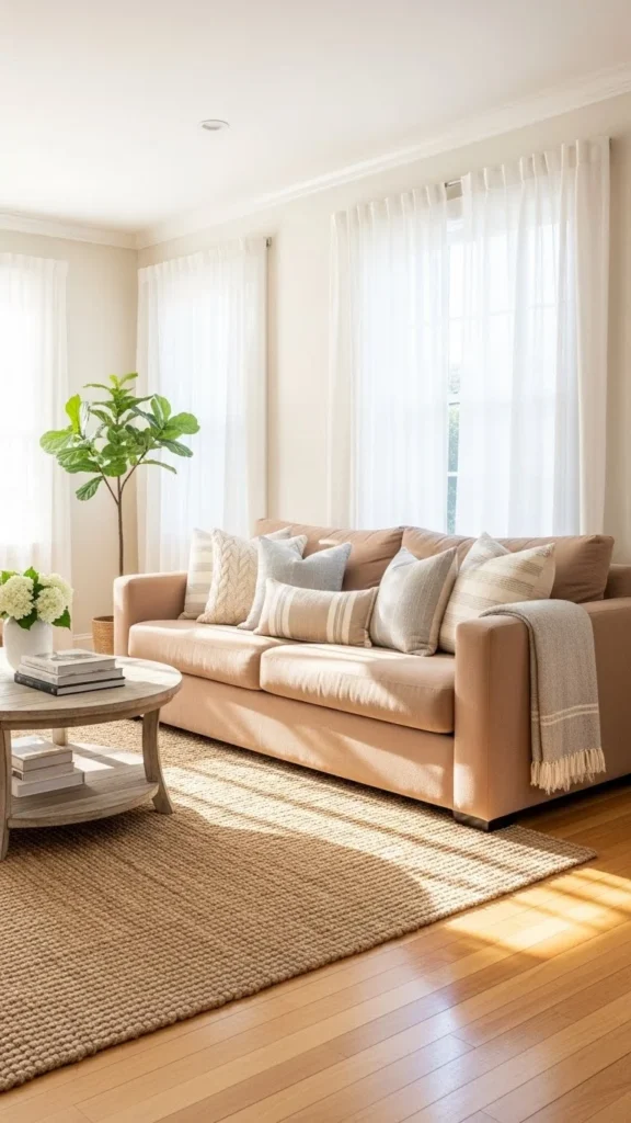
- Soft blues, greens, and warm neutrals often feel calming.
- Earthy tones feel grounded and cozy.
- Light neutrals make rooms feel open and breathable.
Once you’re clear on the mood, narrowing down colors becomes much easier.
Use the 60–30–10 Rule for Easy Balance
If you’ve ever wondered why some rooms just “work,” chances are they follow the 60–30–10 rule. It’s a simple guideline that creates visual balance without overthinking.
- 60%: Dominant color (usually walls or large furniture)
- 30%: Secondary color (upholstery, rugs, curtains)
- 10%: Accent color (pillows, art, décor)
This approach prevents one color from overpowering the room while still giving it personality. Your accent color can be bold or subtle—it just needs to be intentional.
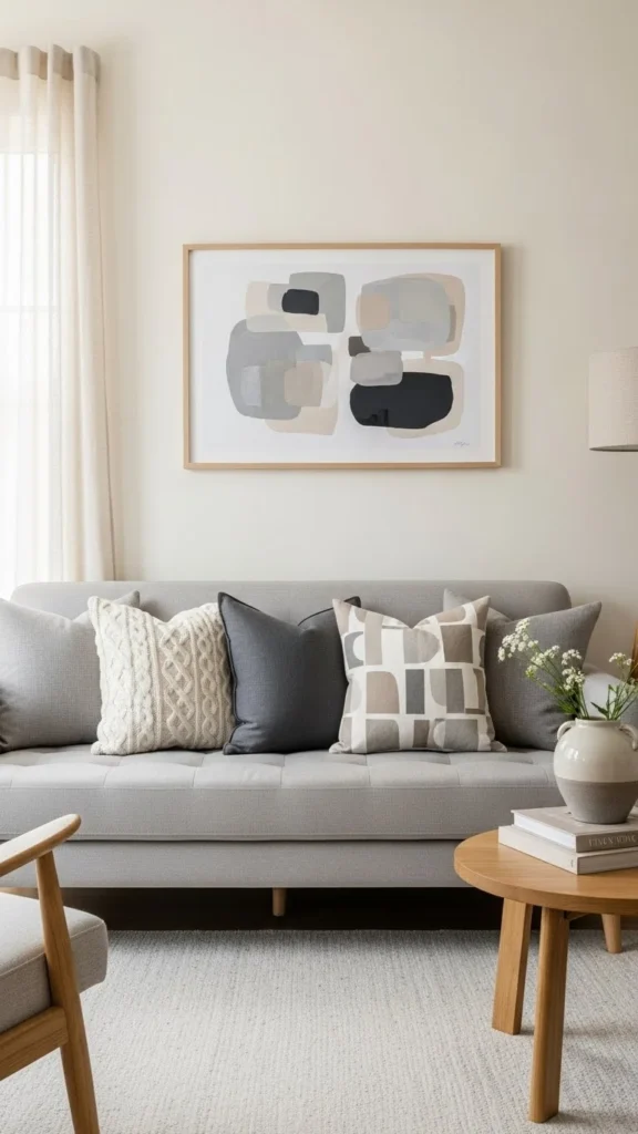
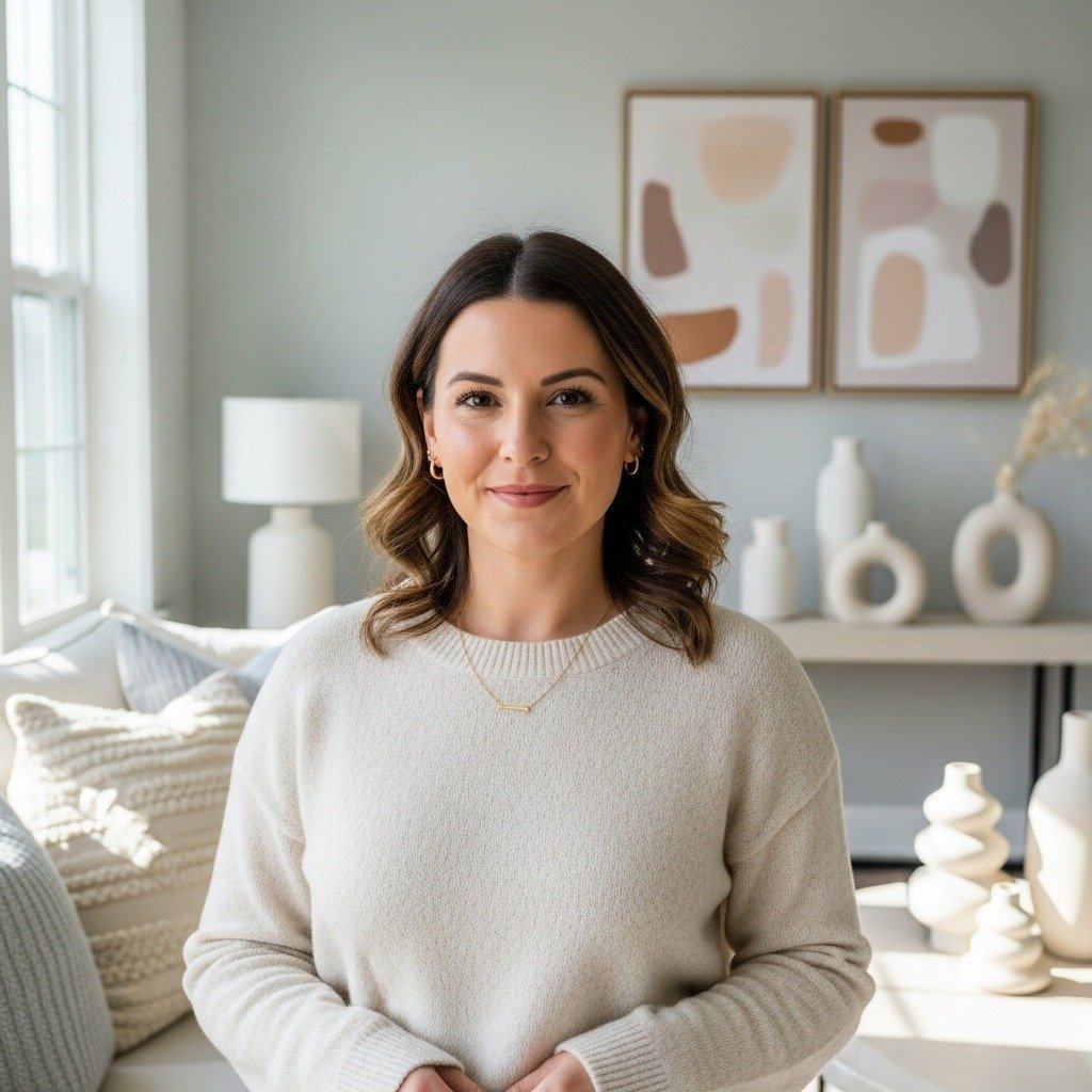
Choose a Neutral Base You Won’t Tire Of
Balanced rooms almost always start with a strong neutral foundation. Neutrals don’t have to be boring; they simply give your other colors space to shine.
Popular neutral bases include:
- Warm whites
- Soft beige or greige
- Light gray
- Muted taupe
When choosing a neutral, pay attention to undertones. A neutral with warm undertones pairs better with earthy or creamy colors, while cooler undertones work well with crisp or modern palettes.
This base makes it easier to update your room later with new accessories without repainting everything.
Layer Similar Tones for a Calm Look
One secret to a balanced room is using variations of the same color instead of jumping between extremes. This technique adds depth without visual chaos.
Try layering:
- Light, medium, and dark shades of one color
- Soft textures in similar hues
- Patterns that stay within the same color family
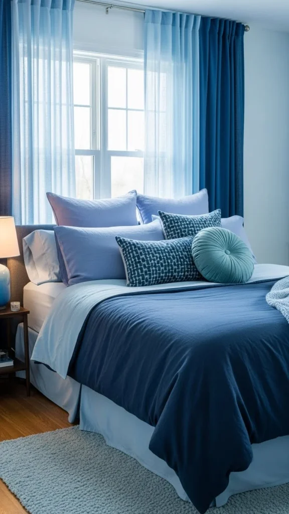
This approach works especially well in bedrooms and living rooms where you want a peaceful, pulled-together feel.
Add Contrast Without Overdoing It
Balance doesn’t mean everything matches perfectly. A little contrast keeps a room from feeling flat.
Easy ways to add contrast:
- Dark furniture against light walls
- Light décor in a darker room
- Natural textures like wood, woven baskets, or stone
The key is moderation. If everything contrasts sharply, the room feels busy. If nothing contrasts, it feels dull. Aim for a gentle push-and-pull between light and dark.
Let Fixed Elements Guide Your Colors
Some things in a room aren’t changing anytime soon—floors, cabinets, large furniture. Instead of fighting them, let them guide your color choices.
Take note of:
- Floor color and undertones
- Wood finishes
- Large furniture pieces
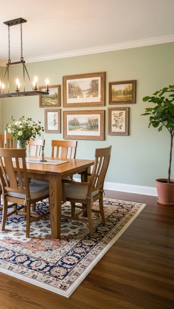
Pulling colors from these fixed elements creates harmony and prevents the room from feeling disconnected.
Test Colors in Real Light
Lighting can completely change how a color looks. What seems soft and warm in a store can look harsh or dull at home.
Before committing:
- Test samples on multiple walls
- Look at them morning, afternoon, and evening
- Observe how natural and artificial light affect them
This step alone can save you from costly repainting and disappointment.
Keep It Simple and Edit Often
When in doubt, simplify. Balanced rooms rarely use too many colors. Two to three main colors plus accents are usually enough.
If something feels off:
- Remove one accent color
- Swap a bold piece for a softer one
- Repeat a color in multiple places to create flow
Design is often about editing, not adding.
Final Takeaway
Choosing room color schemes that feel balanced isn’t about following strict rules—it’s about creating harmony. Start with the mood, lean on neutrals, layer tones, and add contrast thoughtfully. Most importantly, trust how the space feels to you.
Save this guide for later and use it the next time you’re refreshing a room—you’ll be surprised how much easier color decisions become.
Leave a Reply